 Microsoft Azure
 Cloud Financial Management (FinOps)
 How to Operationalize FinOps
TLDR version; We’ve changed our brand–logo, colors, style, and more in connection with changing the company name and announcing an expanded product portfolio. The brand change is more than just changing the logo, we hope this blog gives you more insight into our thought process.
If you’ve been following us closely, you probably noticed that as part of today’s announcements we unveiled not only a new product, Cloud Analyzer, but also a new company name and brand identity.
From the outside it’s easy to only see a new logo, colors, typography, etc. However, there is a lot of thinking that goes into a change like this, so in this post we want to pull back the curtain a little and explain what our new brand identity says about Spot and how it says that.
As Amiram summarizes in his post, the primary reason that we decided to update our brand identity is that our story has evolved–not only have we evolved as a company, but also our products and solutions have evolved and expanded.
A good brand needs to help tell a story–to support and reinforce the story of what the company is, what it does and why that matters. A strong brand identity “fits” the company and its story in a way that speaks to both emotion and logic. We needed to take a fresh look at our brand to help us tell our full story in a fresh way.
Brand and brand identity are certainly about much more than just a logo, but in this post we’ll focus on the logo here as representative of the ideas and story we wanted to convey.
Our Brand Story
When we stepped back to think about updating our brand, we started by asking ourselves what is the simplest way to express what we aspire to help our customers do. We realized that what our customers tell us is that we help them stand out when it comes to how they operate in the cloud–we help them get past the complexity, management burdens and escalating costs that all too often are associated with a growing cloud investment.
“Shine through the cloud” captures that essential story in a succinct, powerful way. Using that idea as our starting point, we worked to capture the most important elements of our story and translate them into our new visual brand identity.
What We Are: Software for the Cloud
First, we wanted to make it clear what we do. We’re not a company selling candy or providing accounting software–we provide software that helps people get the most out of their cloud infrastructure.
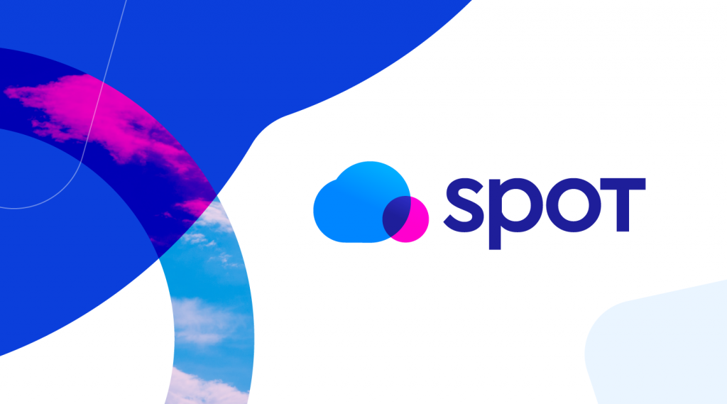
We incorporated a hint of the shape of a cloud in our new logo in part to communicate that, but also to keep a connection to our previous brand identity, which also incorporated the shape of a cloud.
![]()
The blue chosen for this element is meant to evoke a deep blue you might see in the sky alongside clouds, but we also chose it for its vibrancy and for its connection to the primary color of our previous brand identity.
What We Help Our Customers Do: Shine Through Cost and Complexity
It was critically important to connect our logo to the idea of helping customers “shine through” the cost, complexity and related challenges of the cloud. We included the circular “spot” in the logo acts as a spotlight that “shines through” the cloud.
![]()
To emphasize that “shining through”, we chose a magenta color for the spotlight, one that creates a clear contrast to the color of the cloud itself, conveying how different the spotlight that our technology provides is from what customers can see in the cloud without Spot.
How We Do It: Simple, Innovative Technology
When we think about how we help customers “shine through the cloud”, it’s about using innovative technology to simplify running in the cloud, addressing complexities around right sizing, purchasing decisions, scaling, and more.
To convey that value of simplicity, we wanted our brand identity to have a simple look. You’ll notice that we didn’t choose complex shapes, complex colorings, or complex typography for exactly that reason.
The idea of innovation also shaped our logo design. Although the cloud element is an important part of our logo, it’s not just the simple outline of a cloud that is so commonly seen among technology companies. Our cloud is actually composed of the combination of two shapes that would be incomplete without each other–the “Spot” is essential to completing the cloud.
![]()
You also see that simplicity and innovation expressed in the typography in our logo. You won’t find complex typography with frills, serifs, and the like in our logotype for that reason. But you will see that we didn’t just simply type our name for the logotype either–the capital letter ‘T’ at the end puts a little something different in the logotype, reflecting that innovation quality.
![]()
Our Impact
Hearing from our customers, it’s always amazing to hear how big of an impact we’re having on them and their business–saving them 80 or even 90% on their cloud compute bills, taking things that used to be painful and laborious processes and automating them, and doing it all continuously and reliably.
The design of our logo seeks to convey the power of that impact and the confidence that it brings to our customers. The color palette we chose is part of how we convey that–strong, vibrant colors and contrasts.
Not only that, but the logotype also helps to convey that message. The use of the capital letter ‘T’ in the name Spot ends the company name on a strong, impactful note without the heavy, shouting look that would be seen if we had capitalized the entire SPOT name.
![]()
Summing it Up
That’s a look at the thought process behind our new logo. Stay tuned to see how we are expressing our new visual brand identity beyond just the logo, there’s lots more to come!